Pre-Printing Tips for Perfect Results
- ZXC Print
- Sep 26, 2025
- 1 min read

Designing for print is different from designing for screen. 🖨️A few simple checks before sending your file to press can save time, money, and stress — and make sure the final product looks exactly as you imagined.
🔍 Small Text & Thin Lines
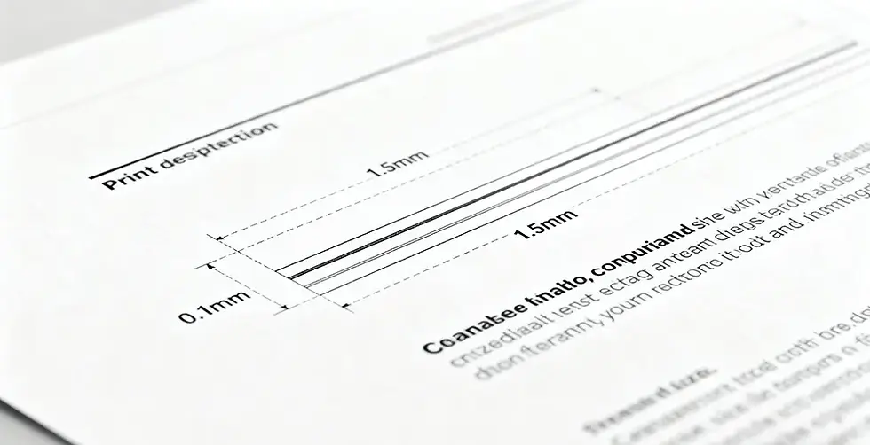
Fine details are the first to get lost in printing if you’re not careful.
Use single-color objects for very small text and lines to avoid misregistration.
Minimum line width: 0.1 mm — anything thinner may disappear.
Minimum text size: 1.8 mm for Chinese / 1.5 mm for English to keep strokes sharp.
Want to see how professionals keep small details crisp? Explore our custom book printing service.
🎨 Reversed-Out Text (Knockout Text)

White text on a colored background looks sleek but is tricky to print well.
Keep it in one solid color to prevent blurry edges.
Choose sturdy, balanced fonts like Rounded Sans Serif or Heiti.
Avoid fonts with extreme stroke contrast (like Songti) — or make them bigger (2.5 mm Chinese / 2.0 mm English).
💡 Final Thoughts
Preparation is everything. Following these tips will help you get cleaner, sharper, more professional print results every time.
Looking for a reliable printing partner? Check out printing in China to see how we turn your creative ideas into reality.


Comments